

Owl Background Picture Feedback

 Colin has sent me this fantastic picture of an owl using pastel pencils and has asked if I can make any suggestions as to how this could be improved. There are a couple of adjustments Colin could make to turn this very good painting into a great one. First of all a section of the tree branch is out of proportion with the rest. The area the owl is resting on is the thickest as it is nearer to us, the rest of the branch tapers away at the side and towards the top right of the picture. However the branch is too thin where I have indicated with the black line and arrow.Both the branch and the owl are the main subjects and as such it would be better to make the background sky areas less fussy. A plain(ish) blue sky with just a hint of other tonal colours would make the owl and branch stand out. The eye is drawn away from the subject at the moment. I would also like to see the areas within the red circle filled in also the top and bottom using the same background colour. Left as it stands at the moment you get the impression that the picture is unfinished.Would you like feedback on your artwork? Colin's tips are just one of the bonuses of being a member of Colin Bradley Art.
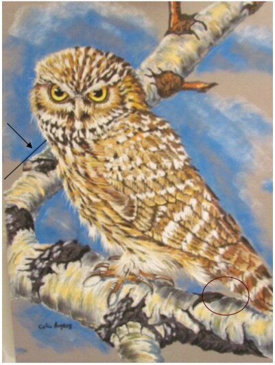