

Creating Contrast in Your Artwork
Brenda has sent me her charming painting of the Kitten project and has asked me for a few tips as to how this could be improved. The obvious point I would raise is that there is not enough strong colours resulting in the lack of contrast, particularly in the lighter fur areas.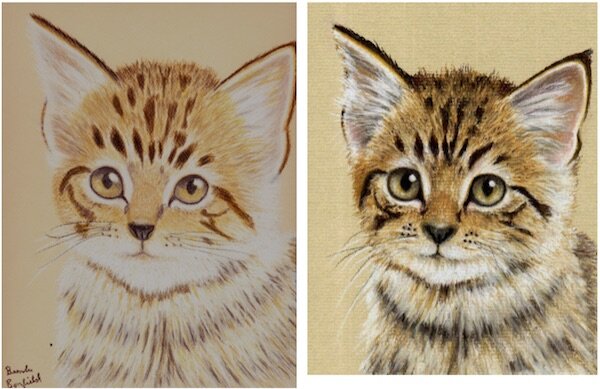 I do understand that when you start off using any medium the tendency is to fight shy of over-applying the darker colours for fear of spoiling the painting. However if strokes of Burnt Ochre (Faber-Castell No. 187) was introduced into the fir then Burnt Siena (Faber-Castell Pitt Pastel Pencil No. 283) applied on top this would dramatically improve the overall appearance of the painting. This would then allow more strength to be applied to the darker markings improving the overall appearance of the painting. Here I would suggest that a stronger application of 177 (Walnut Brown) on top of the existing dark markings would do the trick.All in all this is a very good attempt at the Kitten and Brenda should be pleased with the result.Get feedback on your artwork from Colin when you sign up to our Pastel Pencil Membership.