

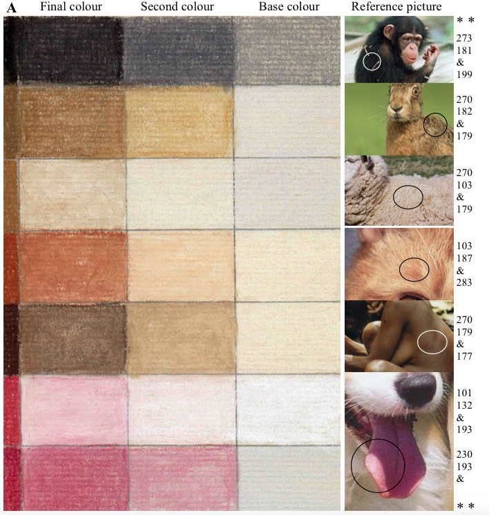
The Basics of Light, Medium and Dark Tones

 When it comes to mixing colours in Pastel Pencils, the degree of difficulty is well known to us this is the reason we go to great lengths explains them in our art lessons.
Light Tones
The rule of thumb is when lighter tones are needed usually a very light base is required. Colours such as white, ivory, light grey etc are laid first and then the medium tones are added to produce the desired effect.
Medium Tones
When a medium tone is required a light colour is put and then strengthened by adding the medium tones with more strength.
Dark Tones
When a dark tone is needed then do not place the very light tones on otherwise you will not achieve the degree of darkness required.In this instance the medium tones are added as a base then the stronger colours are laid on top of this darker base.When black is added this should not be placed directly onto a medium tone as this would mean that the black becomes too dominant. This is overcome by placing a 'buffer' colour between the medium tone and the black this will have the effect of allowing the black to be a 'darkening agent' and result in a more pleasing effect. All colour tones are treated in the same way.I hope this helps clarify the process in which I achieve light, medium and dark tones in pastel pencils. Have a question? Let us know in the comments below.