

Drawing Autumn Scenes using Pastel Pencils

Even though we've just left Autumn behind and are now into our Winter months, I thought I'd touch upon Autumn colours and how to achieve the warm tones in the leaves. My painting and tutorial "Walk in the Autumn Mist" is a great example of all the colours I'd use for an Autumn scene. In pictures like this, ivory and grey are your base colours. In the Faber-Castell Pitt Pastel Pencil range which is what I would always recommend, 103 is your Ivory and 270 grey. These are great base colours to start with.If you're doing a picture which has lighter, golden colours the ivory would be ideal because that makes the yellows and the oranges that you are going to put on top register better. If want to achieve stronger colours like dark brown and richer ochres then grey is a better base colour. If you used grey for the yellow and orange colours, they would look weaker. If you put the richer colours straight on without the grey base then they would appear too strong. By putting the grey on (No. 270 in the Faber range) it pulls the colour back a bit and when those other colours go on they are tempered.A typical symbol of Autumn are conkers. With a conker you have a very rich burnt sienna, (no. 283 in Faber-Castell's range). So for this I would recommend putting down the grey I mentioned previously, 270. You put the white on the shiny parts of the conker and then the grey around it. There are parts of a conker that are really dark, almost to the point of being black so for this I would use a medium tone grey like 273. Then I would put darker colours on top of this - 186 or 187. After that, to bring the warmth in I would add orange (109) and then graduate through to 283 then 177 and black.[fusion_builder_container hundred_percent="yes" overflow="visible"][fusion_builder_row][fusion_builder_column type="1_1" background_position="left top" background_color="" border_size="" border_color="" border_style="solid" spacing="yes" background_image="" background_repeat="no-repeat" padding="" margin_top="0px" margin_bottom="0px" class="" id="" animation_type="" animation_speed="0.3" animation_direction="left" hide_on_mobile="no" center_content="no" min_height="none"]
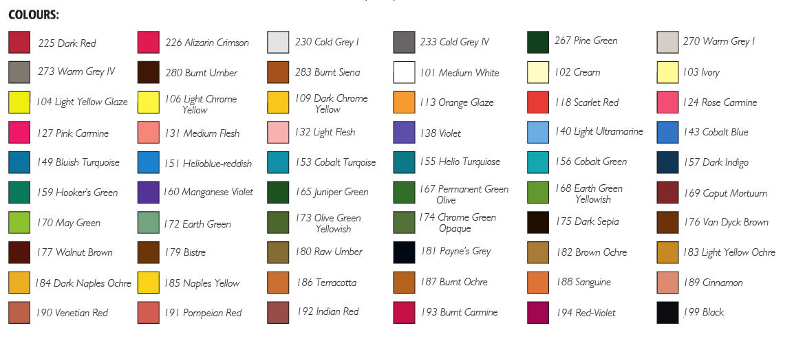 I refer to the numbers of the pencils because then there is no confusion with the exact colours I mean. Using the term "grey" could mean any sort of grey. As you can see, achieving these darker tones requires a more advanced understanding of the base colours going on underneath. To get black in pastel pencils doesn't just mean putting on black, there are a number of colours which need to go on first. Especially if you want a warmer or cooler tone to black.If you found this article helpful and would like more tips on base colours, do let us know in the comments below. To watch the Autumn Mist tutorial, log into the members area or to sign up and create an account, click here.[/fusion_builder_column][/fusion_builder_row][/fusion_builder_container]