

How to Draw Ginger Fur using Pastel Pencils

One of our members Sally wrote us an email asking for some advice on drawing ginger fur on a cat. Sally writes:
Hi Colin and Steve, my friend has asked me to do a picture of this cat, recently deceased, I have had it for six months now, I keep starting it but just can’t get the ginger colour! Have looked at different tutorials for help but not getting any where, help ! This is one of my efforts, thank you Sally
Here are the pictures:

Choosing Colours
Ginger fur is not easy to achieve and believer it or not I have always had a problem trying to create that colour.Sally has chosen good colours for the fur, there is a couple of colours that she could add in that might deepen the fur more. As always with the advice, this is just a guideline and it's important to experiment with the colours suggested on spare paper first.There is a great colour in the cretacolor range of pastel pencils that would work on top of the colours you have already done. This is number 210 which is Sienna. We now sell individual colours in our store so that customers can increase their range of colours for their pictures. Sienna is a similar colour to 186 and 187 which are ochres in the Faber-Castell range.There is another colour in the Faber-Castell Pitt range - 118 Scarlett red. It's worth experimenting with adding a bit of this on top too. In the cretacolor range, 212 - Indian Red could also be used, this red in cretacolor is more mauvey. These are all options to try.
Base Colours
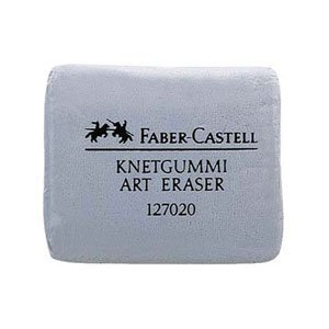 It's possible that Sally has put a little too much light base colour on the picture which means these stronger colours going on top might not register as well. With a picture such as this which has a strong tone you need to get to that dark tone as quick as possible. You do this by minimising the base colours you put on. Easy to say but not so easy to judge. To remove some of the colour you could use a Putty rubber (Kneadable eraser) to dab some of the light colours off.As an example, in the ears this is what I would try - a bit of light grey, followed by a light pink then a stronger pink (such as 131 Faber range) then 193 Burnt Carmine. If I know the finishing colour, I work out how to get there with the least colours possible. When we talk about "cushion colours", this doesn't necessarily mean lots of colour, just enough to cushion the tone.I hope that helps, we'll also be talking about this picture on the feedback show to give more advice. If you would like to get advice on your future pictures, feedback on your current pictures and access our video lessons, then our membership is perfect for you. Our prices start from just £3.99 ($5), click here to learn more.