

Choosing Pastel Pencil Colours for Drawing a Brown Dog
One of our members Ian sent us an email asking for some advice on colours for his Son's Dog Vinnie. As a member Ian can request advice and tips on pictures that he's doing. Ian writes:
Hi Colin & SteveI have been having tremendous fun drawing with you in pastels. I only just discovered you and few months ago and have now joined drawing animals. Great fun and what a great teacher you are, so calm and passionate.I want to draw my sons dog Vinnie (see photo), but I cannot find a colour combination. He is a strange colour.Are you able to help with this and if so I can send you a photo when finished for your professional comments.He looks different colours in different lights.Many thanks in advanceRegardsIan
Here's the photos from Ian.

Constructing the Picture
The first point I would do is use the darker image as the reference photograph. You have darker colours and with the other one the colours are more difficult to achieve.I would also suggest leaving the collar off the picture. This is what I would do.The composition is quite easy, you want the head to be the main focus but also have some neck and shoulders in too. We are going to mention this picture on our next Feedback show on YouTube where we will talk about composition.
Overal Tones
Now we're looking at the darker picture I can talk about the colours I would use. As always this is just a recommendation on colours based on looking at the picture. There are always going to be more colours needed for the picture and they may change depending on the results you are seeing on the paper.The base colours I would use are the warm greys so 270 (light grey). Then I would darken this with 273 (medium tone grey) and 176 (Van Dyck Brown).In fact, you could probably do most of the tonal value in this picture with those 3 colours. So for the light and medium tone areas you start with the light grey and in the darker areas, start with the medium grey (273).When the van dyck brown hits the grey it will turn it more or less that colour.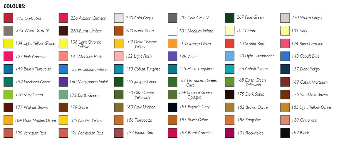
Additional Colours
If you wanted to incorporate some additional colours then in the Cretacolor range there is an ideal colour for this picture which is 217 - Bistre. We do now sell individual Cretacolor pencils on our store for students that want to increase their range of colours.Another 2 colours that could be used to darken the fur further are from Faber-Castell - 175 Dark Sepia, this can be used lightly on the medium tone areas. The other is 169 - Caput mortuum, you can try adding this into the fur as necessary around the eye and on the nose.As I've mentioned there could be more colours and it's best to experiment on spare paper the combinations of these colours to check you are getting the results you desire.If you would like to get advice on your future pictures, feedback on your current pictures and access our video lessons, then our membership is perfect for you. Our prices start from just £3.99 ($5), click here to learn more.