

Creating Richer Looking Fur in Pastel
Gwyneth has sent me her picture of the Kitten project and has asked for any tips I can give her to help improve the painting.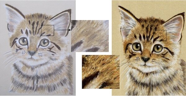 On the whole Gwyneth has done a good job but the main problem is the dull appearance of the fur. The reason for this is the over application of the light colours resulting in the stronger vibrant colours appearing weak when placed on top. This is very common when starting out with the pastel pencils and I am sure most of you will recognise this when doing your own paintings.The way to get around this is to apply the lighter base colours sparingly and not over apply them when you see the stronger tones appearing on your reference pictures. This is the kind of exercise you can practice on spare pastel paper. Notice the difference between the insert of Gwyneth’s painting above and compare it to the original painting on the right. If I was to use the ochre's and rich browns on Gwyneth's picture I would still not be able to bring the true colours back because there is so much light colour applied - it would look muddy.The lesson here is keep the lighter base colours to a minimum allowing the richer tones to shine.Has this article helped you? Let us know in the comments below.