

Creating Contrast in Animal Eyes
Lise has sent me her picture of the Kitten project and has asked for a few tips to help improve her techniques. Lise joined us as a member recently having seen my work on youtube and decided to give the pastel pencils a try. I have to say that this is a very good first picture and I am sure that with more practice Lise will excel with this medium.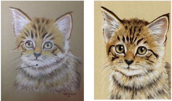 I have placed my original Kitten picture along side Lise’s painting so that I can point out where improvements can be made. The pastel paper used here is slightly darker than the sand colour I prefer to use therefore the colour of the paper is showing through. It is quite noticeable on the chin area (see black arrow), this could easily be corrected by applying a stronger application of white.The markings are quite good but could be a touch stronger which would create a better contrast. This also applies to the pupils and outline of the eyes. I would use a sharpened dark brown or dark sepia to do this.The eyes would be more effective if the areas above the pupils were strengthened a touch - perhaps with the same dark brown or sepia used for the markings.