

Charcoal Effect using Pastel Pencils
Early in my career I tried using charcoal and I found it very messy. I had also tried soft pastels and found them very messy as well. Charcoal had the depth of colour but not the finesse and control that I enjoyed. I tried graphite pencil but this did not give me the results I was looking for. When I discovered the pastel pencil medium, I finally had the control and depth of colour that satisfied me. Fast forward 30 years and in 2013 I realised that by using just 1 pastel pencil (Faber Castell's 181 Payne's Grey) I could produce a similar effect to charcoal on good quality cartridge paper.This is the finished result and you too can learn how I did this picture by downloading our Exercise sheet here and also watch the tutorial here.
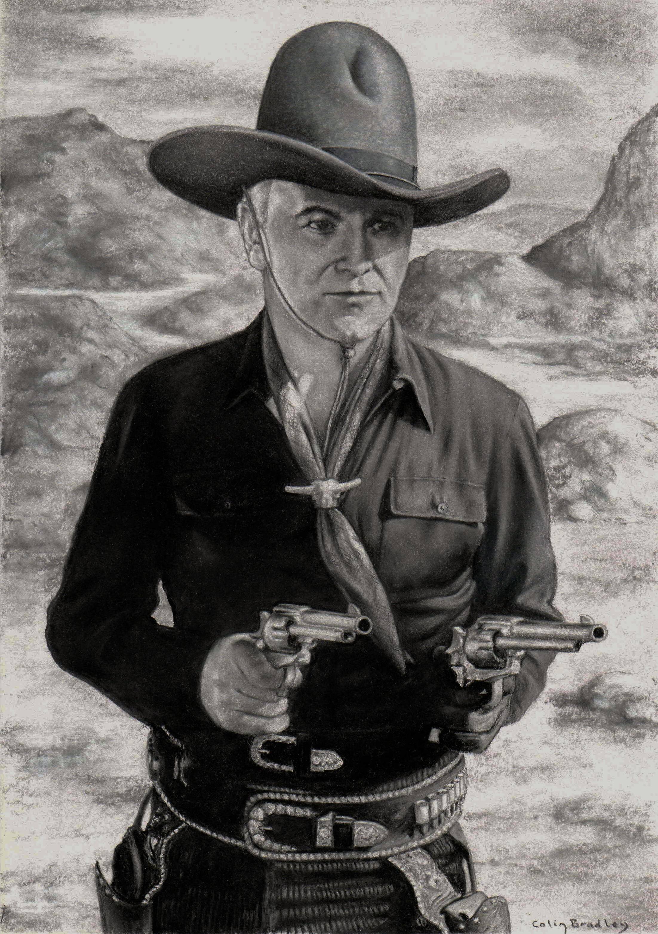 I then tested the limits of this new discovery by producing a second picture (Hopalong Cassidy) which you can see here. For this I used five pastel pencils - numbers 230, 233, 181, 199 and 101 (white). These are greys and black and white and I used them on white sketching paper. To start I covered the whole paper area in the light grey in order to create a cushion on which to use the other pencils, enabling them to be blended. The black and white gives you a dimension and teaches a lot about tonal values. It is also possible to put white over the greys to blend. I did use the colour shaper but most of the blending was done with the pencils, not with the finger. This gives control over the tonal values.I recommend you give this new idea a try as you can the results are stunning. Have you tried this charcoal effect? How did you get on? Let us know in the comments below.