

Why I Use Base Colours To Achieve My Final Tone
One of our members, Laura, sent in a great question regarding layering colours. With all the new pastel pencils and colours available now, is it necessary to layer base colours to get your desired effect or can you simply jump to the colour you want? Here's Laura's email below:
Hi,After having done a few pictures, I noticed that often times when Colin is achieving a particular shade or tone of colour, he will apply multiple layers of different colours to get to that point, especially in backgrounds. I know that when he started, the colour options / brands/ variations of shade were more limited than today with all the colours on the market.So my question is, because of the larger variety of colours now, is it still necessary to use all the colours to make a certain shade rather than going right to the closest pencil shade that you want to achieve and applying that directly.For example, I recently did Colin’s Rose v2 and on the background where he used 230, 233, 172,181 and 157 to achieve the dark background. Could he have gone directly to a closer shade of pencil to get that midnight bluish background quicker than the application of 5 bases to get there in the end and still have the same depth in the colour?I hope I am making sense ????.Thanks in advance.
Here's the picture Laura's referring to below:
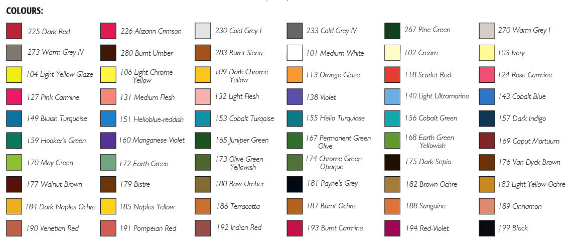 This is a good question, so let’s take the background Laura has mentioned regarding the rose. The simple answer is yes I could have just used 157 (dark indigo) to achieve the dark blue however 230 (light grey) is a great base colour and by adding 172 (earth green) it produces a rich undertone for the deeper colours to follow. I don’t like applying a very dark colour, 181 (payne's grey), directly on top of a light tone therefore 233 (mid grey) serves as a good intermediate colour.157 is a lovely velvety tone and enriches the final effect I wanted. These colours in the order I have choose to use them each serve an important function to fill the pastel paper and as they are blended together I felt served to enhance the final effect of the work.Over the many years of working with the pastel pencils I have found that I work instinctively and almost always without questioning the choice of colour that springs into my mind. This is going to seem weird to many of you but I can’t describe it any other way, it’s equivalent to the question I get asked a lot "How do you know when to stop?"I can’t answer that either, my answer is "I just do!"If you would like to learn how to draw the Rose picture above and access all our pastel pencil courses, visit our membership page to find out more.