

White Horse Pastel Pencil Picture Feedback
Gabriele has sent me her picture of the White Horse project and asked where it could be improved. I have to say that this is a very good representation of my original, on the right.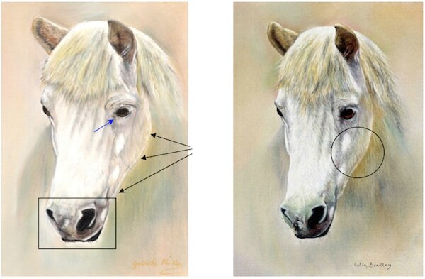 Gabriele mentioned that she was trying to make the contrast stronger and wondered if it was strong enough. This gives me an opportunity to explain the idea of contrast in a painting in more detail. The nostrils in Gabriele’s painting are just about right and although the area immediately surrounding the nostrils could be deepened slightly the effect is still good, see the square box. The left eye is slightly misshapen but again of the right strength, the immediate surround to the eye could be deepened this would represent the dark eye better, see blue arrow.The whole of the white fur could be strengthened as the picture above shows, compare this to my picture on the right.The contrast between the right side of the head and the neck could be deepened as the contrast here is weak, see black arrows. I have circled the area on my painting that shows this subtle contrast very well, the relationship of all the tones is just right.We spoke more about Contrast in last week's podcast recently aired online.