

Tips to Improve this Kitten Portrait
Caroline has sent me her painting of the Kitten project and has asked for my comments she writes:"Please critique my pastel. I didn't use Ingres paper but have some on order also I used Carb-othello pencils."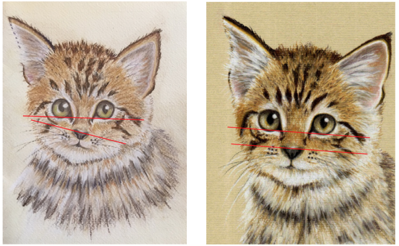 Another example of how popular this Kitten project is and how well the painting has turned out.Caroline has joined as a yearly member so will have lots of time to practice the techniques. There are a couple of tips I can offer on this work.First of all what stands out is the eyes and the nose are out of alignment. I have placed two red lines on both images above to help Caroline see this.The Ingres pastel paper would certainly help to create a better tone to the picture as the light paper bleaches out the image. What seems to have happened as a result of this is that a little too much base colour was applied not allowing the stronger colours to register. The pupil in the left eye is slightly smaller than the right but on the whole a very good piece of work.To receive feedback from Colin on your art, join any one of our membership packages.