

Paul's Two Birds Feedback - Branches, Claws and Contrast
Paul, who is one of our members, sent in his picture of the Two Pretty Birds for some advice. This is one of the bonuses to joining our membership. Paul writes:
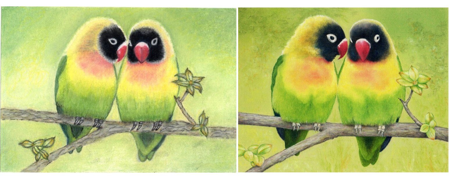
Hi there, just finished the course "Two Pretty Birds" which are Black Masked Love Birds. I reduced the size to A5 as this is nearer the actual size of the birds and looks cuter. I also added a pupil to the bird on the right left eye. The tree branch was difficult and also getting the claws to stand out, I know they should have been in shadow but this made them disappear from sight.I would appreciate any advice many thanks Paul.
 To listen or read Colin's advice see below:
Transcription:
Hi Paul I'm looking at your picture of the two pretty birds. You've done quite a good job of this. I can see where you're going wrong with the branch though but you're not alone. We've had many many people come to us with tree trunks, branches and that kind of effect is really hard to do. One of the things that I will point out to you is that if you look at your picture and if we particularly look at the left hand side of it you can see that you have no contrast between the top and the bottom that's the top of the branch and the bottom. Therefore you've got no roundness.If you look at mine, you'll see that I've got a darker bottom. The last quarter of the picture is dark. That would have made a big difference to it. And the other thing is to sort of emphasise the lines just a little too much. And if you if you just break that down a little bit or weaken that and apply the depth underneath it, you'll see a major difference you won't believe the difference.As far as the claws are concerned yes I can see what you've done is you drawn them in whereas I've created them. Now the difference between a drawing and a creation is the line that you put in you see what I mean you've got lines so you've just drawn them. What you need to do is have the contrast.Now once again had you put a darker area underneath that bird on the left hand side it applies to the bird on the right as well but let's look at the left hand side for the moment which is a bit of more obvious. If you have made that just a little darker at the bottom, just a touch, you would have been able to put them in lighter like I've done so this is another point and it's easier to do it the way you've done it but it doesn't look right, as you point out.The other thing I would point out is you've added the pupil to the bird on the right hand side. Now you you'll notice that I haven't done that. The reason I haven't done it is because it wasn't on the original picture that I was looking at. When you make something like that up you've got to be a bit careful because if you get it wrong and I think you may well have got that wrong - you can put it in the wrong place.I mean sometimes you'll see me put a light in an eye that wasn't in the original and very often I mention it when I'm doing it that's a white highlight and sometimes I do it I get it wrong. So I have to do it again because as soon as you do it you think well it's not quite right. Now I leave it to you whether you leave it there or not. It doesn't look that bad and it's only someone like me will come along and tell you because you've asked that it could have worked out differently had you applied or not applied the pupil.Anyway I hope that's helped. I look forward to seeing more of your work but those small points I've given you are major points so take heed of them. Bye for now.