

Kathy's Rainbow Picture Feedback
Kathy has sent me her picture of a rainbow over water and has asked for any tips I can give as to how this could be improved. First of let me say that Kathy has included three really difficult subjects in one painting, sky, rough sea and a rainbow and has done a remarkable job.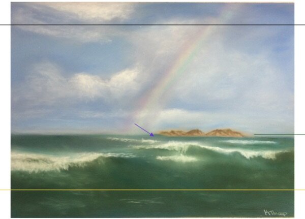 I would have preferred the sky to be a little darker this would have shown up the rainbow colours better. There is a touch too much water and if the sky was lowered slightly too then the shape would give a better landscape effect. I have placed gold and black lines as possible cut off points, notice how much better the composition is now.The island does not quite work as the left hand side needs to be lower in the water, see blue arrow. Also the water on the right side needs to be slightly higher to bring it level with the water on the other side, see green arrow.All these suggestions Kathy can easily apply to this picture (apart from the darker sky, this is best left alone) and I think the improvement it will make to the overall effect would be stunning. Become a member of Colin Bradley Art and you can receive feedback on your Pastel Pencil Pictures.