

Drawing an Iris using Pastel Pencils
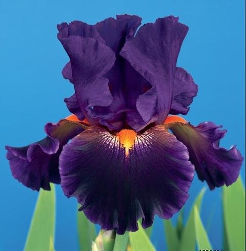 Leni has asked me for help with pastel pencil numbers for this Iris picture she wants to do. I thought it would be a good idea to show it here on the blog as I am sure that everyone will be interested to know how to build up these unusual colours. The pencil numbers referenced are from the Faber-Castell Pitt Pastel Pencil range and can be purchased from my art store.To achieve the deep mauve look follow these guidelines, apply 138 then apply 151 on top of this then blend together, now add a little 199 before applying 138 again, then blend. This should give you a good tone and by adding 160 for the lighter areas and more 199 for the very dark areas you can vary the light medium and dark as needed.Where you see white on the petal then white 101 must be applied first. For the slight greenish tone apply 167 or 267 where required and for the yellow/orange colour apply 106 then 109 deepen this with 113.This colour of this Iris flower is a very tricky and although I have given a selection of the main colours I see almost certainly you would need to add more as this build up progresses. I said this would be interesting didn't I?