

Blending Contrast in your Pastel Art
One of our members Paul has been a member for a few months and has sent in some of his work for feedback. Paul writes:
Hi Steve and ColinI have been following your on line courses for nearly 3 month now and have enjoyed it immensely. I have tried many of your pictures and found each one challenging and learnt a lot. I have attached some of my work love to have some constructive feed back on them.Paul
Firstly let me say Paul has done really well on both of these pictures. Let's look at the Prowling Tiger first, this is a very difficult picture and I'm always impressed with how our students handle the techniques needed for this picture.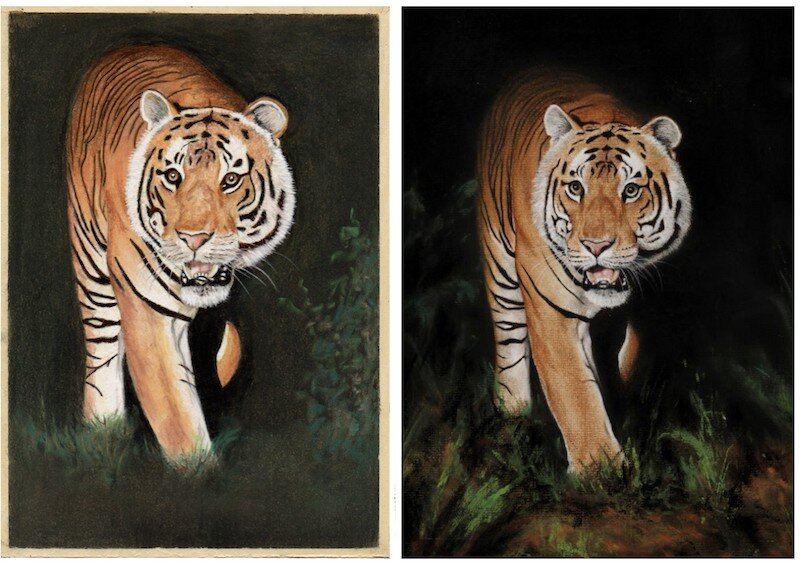 There's really only one thing that I can point out which is the contrast. In some white parts of the image it is a little too light, the contrast is too great. You can easily correct this by tempering the white with greys. One area I can pick out here is the leg that is showing through the darkness. The rest of his picture he has done really well.
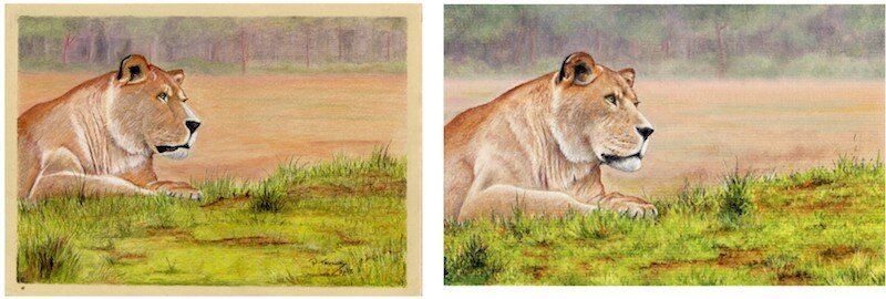 Paul's also done really well with the Lioness Landscape. He's done a fab job of the grass and the background. There are areas similar to the tiger - there's a little too much contrast. For example, rather than have black and white, you should have black and 'greyish' white. It's a good idea to look and see this in the reference picture to get an idea of what I mean. Lastly, I think he's done a great job of the eye, good work.If you would like to get feedback on your pastel art and access our video lessons, then our membership is perfect for you. You can join us from just £3.99 ($5), click here to learn more.