

Why I Start With Base Colours When Using Pastel Pencils

There are several questions that I am asked regularly regarding the layering of pastel pencil colours in my work. I thought it would be a good idea to address this to give you a clearer picture of the techniques I use and how I arrived at them. this will help to end the obvious confusion students have as it often goes against many of the known procedures that was taught in school art lessons, art school etc.[fusion_builder_container hundred_percent="yes" overflow="visible"][fusion_builder_row][fusion_builder_column type="1_1" background_position="left top" background_color="" border_size="" border_color="" border_style="solid" spacing="yes" background_image="" background_repeat="no-repeat" padding="" margin_top="0px" margin_bottom="0px" class="" id="" animation_type="" animation_speed="0.3" animation_direction="left" hide_on_mobile="no" center_content="no" min_height="none"]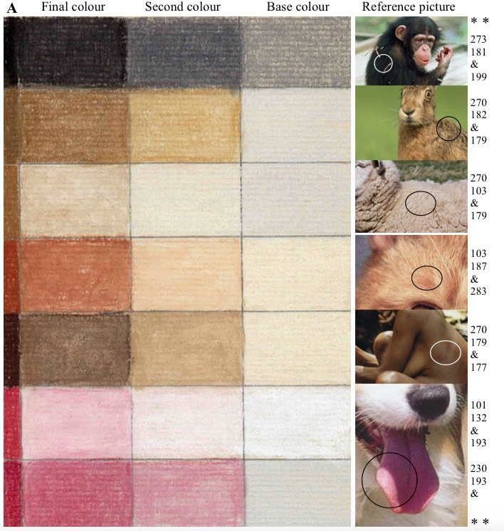 First of all the pastel pencils are like no other medium therefore what is needed is a new set of rules for this comparatively new medium. I found that when I started out using the pastel pencils over 30 years ago they were used as a sketching pencil, used similar to normal coloured pencils or to give finer detail to support soft pastels. My first few pictures using this new medium where used laying the colour down without any mind to building up the colour but instead applying the colour raw, if I saw brown I applied brown, blue I applied just blue etc etc.Very soon I realised that I needed to find better techniques if this was to ever be successful, particularly as I was trying to make a go of animal portraiture. I had already had several years experience as a watercolour artist where I would use several colours mixed together to produce the exact colour I needed. Although the pastel pencils would not work mixing the colours in a palette they would work applying one on top of the other, by experimenting I found that I could achieve the same subtle tones as I did with watercolour.
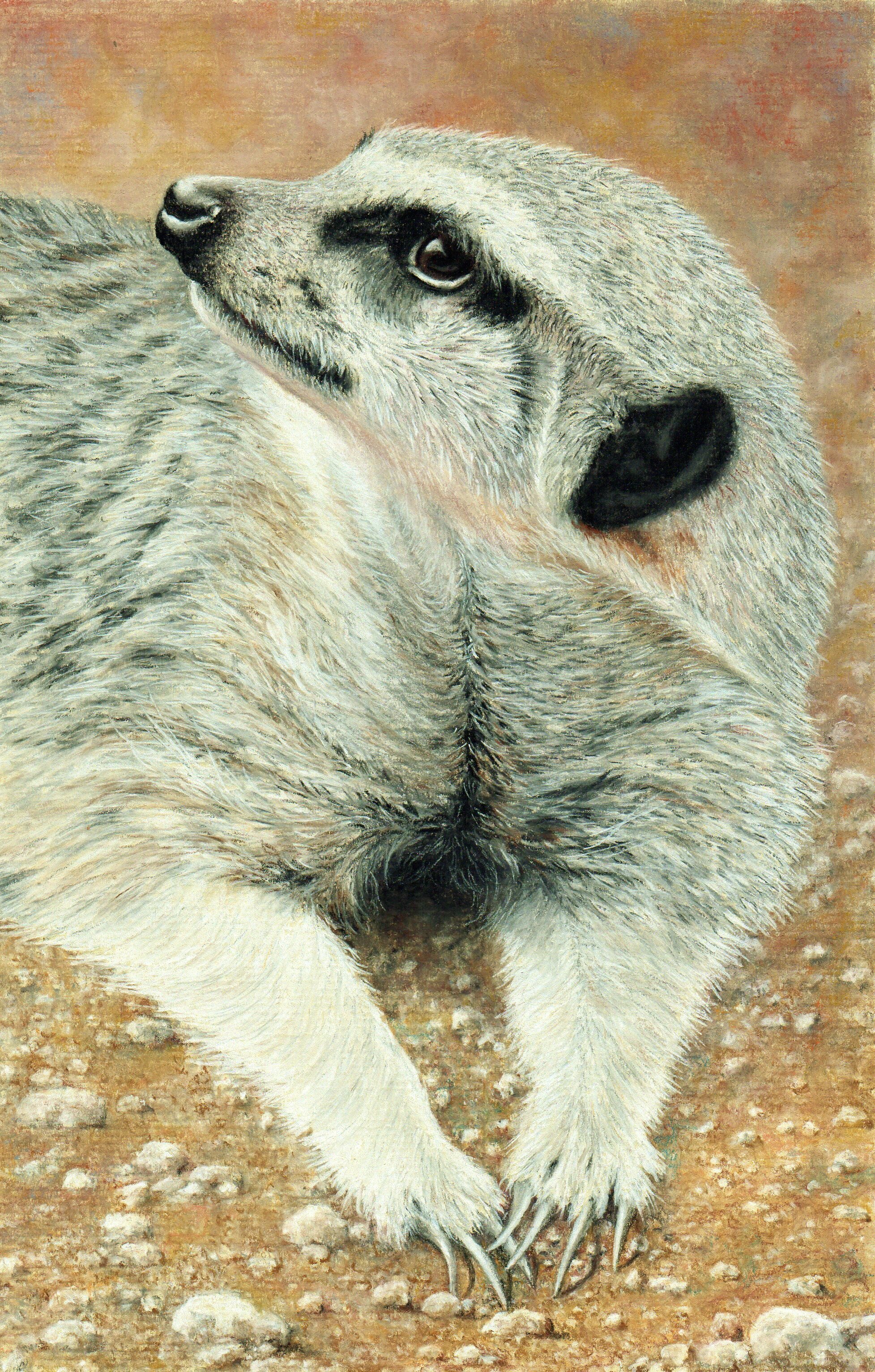 I mostly work from light to dark, again a leftover from my watercolour days, as this produces colour mixing without creating a muddy mess. It also allows me to introduce a base colour that influences a subsequent stronger toned colour applied on top. I am often asked why I don’t I use a shortcut such as when I see brown in a picture why don’t I just use a brown pencil instead of perhaps using several base colours first. Using raw colours can result in a very harsh effect, it is rare that this would work when attempting to produce a natural colour in animals or landscapes, which makes up the bulk of my work.Understanding how to see these subtle tones and selecting the right colours to produce them is hard for students starting out with pastel pencils. But it can be learnt by watching my videos but better still through experience of using the medium. The secret is to forget things you have been told to do with other mediums and check out the finished results of my finished work.[/fusion_builder_column][/fusion_builder_row][/fusion_builder_container]