

What Colours to Pick for a Chocolate Coloured dog
One of our members Anita sent us a lovely picture of a dog that she wishes to draw and asked for some advice on colours. With my colour choices I am assuming Anita will be using the sand coloured paper that I use for majority of my animal pictures.
General Tones
To be clear, the colours I am recommending are just a basic set of colours. I always recommended to test out these colours on spare paper first to ensure you’re happy with how it looks. The colour numbers referenced are from the Faber-Castell Pitt Pastel Pencil range.When I saw this picture my mind instantly thought of using the ochres such as 187 (Burnt ochre) which a great colour - soft and less vibrant. Then you've got 186 - Terracotta, which is more vibrant.188 Sanguine is a colour I would use, as well as 283 Burnt Siena and 177 walnut brown. These are basic colours that you could try across this whole picture.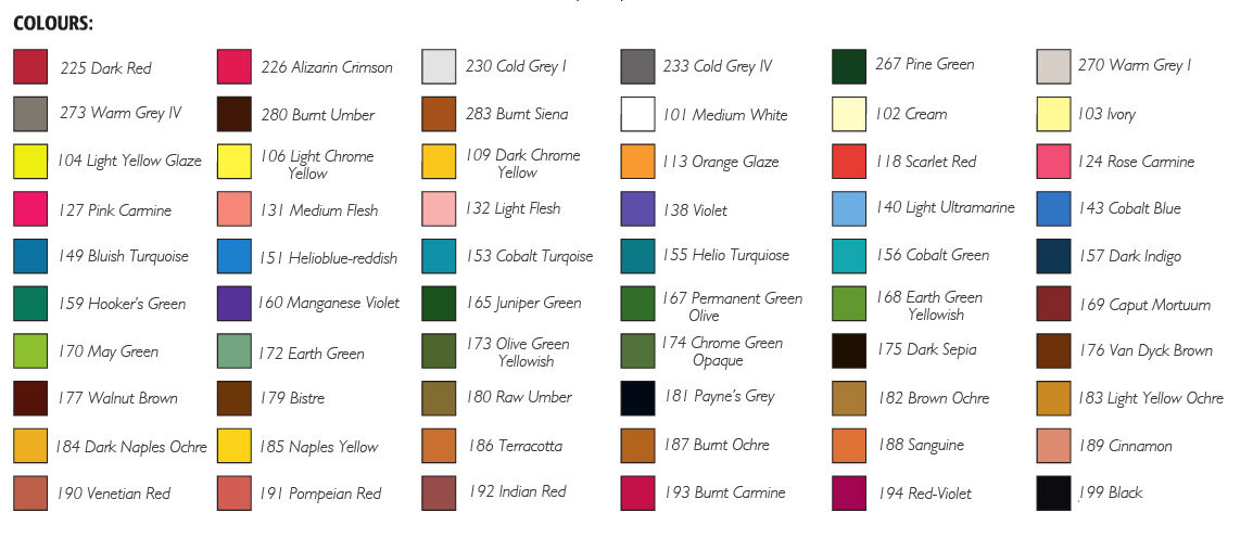
Base Colours
For the lighter areas such as over the nose I would probably use ivory as a base colour. Otherwise I would probably use the warm greys on this picture, so 270 Warm Grey I and a mid tone grey such as 273. These would be the base colours in the various light and dark areas.Then you would add on the 186 and even possibly the 187 together. If you are unsure on which one to use then try both. You want to play around with these colours on spare paper, I can only give you the colours that I am seeing, there is certainly going to be more you'll need to add in. For example in the very dark areas, you would definitely need to use black on top of all the tones, to really enhance the dark sections.For the nose, I would start off with the greys, so 270 and 273, then add a 175 which is dark sepia. Then you'll want to bring a little brown in so maybe add 177 on top of the 175 and darken with black.When we do these blogs, the aim isn't to give you or any other student the exact colours you need, simply to provide a starting off point. Play with the colours I suggest, try the combinations. Be prepared to adjust and add more in, for example I can see at the top of the head you may want to add some red in 190 Venetian Red for instance could give you a richness.I hope that helps Anita and others learning from this blog. Advice such as this is a bonus service to members of our website. If you would like help with your pictures and access all of our tutorials, learn about our membership here.