

Tree Contrast in Watercolour
Yvonne sent us her picture of Yalding that completed following our tutorial on the website. Yvonne asked for feedback on her work. She writes:
Hi I have just completed the watercolour of Yalding Kent. I didn’t have sepia so I used Burnt Umber to paint this picture. I really enjoyed just painting in the one colour. The only thing I am not so happy with is the trees. I would value your opinion of my picture. This is the first time I have requested a critique of my work. Thank You. Regards Yvonne
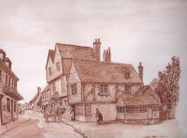 Listen to or read Colin's feedback below:Hi Yvonne. Steve sent me your lovely picture you've done of Yalding in Kent and I understand you're having a few problems with the trees. This is not surprising because trees as a rule are very hard to do so I wouldn't be too unhappy that you haven't achieved it. It takes a long time. The thing about trees is you have to have contrast. And what you've got there is not quite enough. You've got to go in with a little bit more strength. What I tend to do and if you look at the video again you'll see I work my way towards the darker colours. This is something that would take a little bit of practice. If I were you I wouldn't touch your picture. It's fine. Leave it alone because you could ruin it if you try. But I do on a spare piece watercolour paper I'd try it again. In fact I'd try it several times reproducing this, following my instruction and trying to see how it's done. It's not easy and it's not easy to explain how it's done. This is why I like to show people rather than try to explain it.The other thing is if we leave the trees alone at the moment. The horses in the front. Everything else - the buildings, no problem at all. But when you come to characters you've got a little problem because you've got to be very wary that you don't make anything too dark. Or in the other hand to light. Now in this case you haven't made the contrast strong enough which means you need more depth there. And again if you look at my reference picture and the way I was doing the watercolour of that character you'll see that I did use quite a lot of strength. You've got to watch too whenever you're putting something in the foreground that the background doesn't interfere with it which is actually what is happening.If you look above the horses and the gentleman is hard to distinguish them. This is because you need, when you're doing something like this, to do the characters first. And then the background afterwards if you can. Sometimes that's not possible but it does work better that way because you already know how light or dark you need the contrast to be. That is the best tip I can give you. Otherwise I'd say generally speaking you've done very well. And I don't dislike the burnt umber wash either. Anyway I hope this helps. I'll let you get on with it and hope that we see and hear from you again very soon.Get access to our courses and receive feedback on your work by clicking here.