

Poppy Artwork Feedback

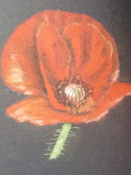 Gwynie has sent me her picture of our Poppy exercise and has asked if I have any advice on how this can be improved. I feel that this is a very good interpretation of the Poppy project and Gwynie should be pleased with the result.Gwynie did not have any of the Sand Coloured Ingres pastel paper we recommend so used what she already had around. As you can see the paper was really too dark for the pastel pencil medium which accounts for the rather dull appearance of the colours. As you all know I do not advocate the use of dark colours when using our pastel pencils even though it does mean that a background is not as necessary as it is when using the lighter tones.Gwynie wants to experiment with backgrounds and I would agree with that as long as she means using pastel pencil colours and not different shades of dark paper, unfortunately the pastel pencils will never look that great done that way.Should dark papers be something that the students want to try then I would suggest that they use soft pastels as the pigmentation is stronger than with the pastel pencils and therefore produce a brighter result on these papers. However it is more difficult to create the same degree of detail and a more impressionistic approach is needed.To receive tips on your artwork, sign up to Colin's Membership and learn how to draw using Pastel Pencils.