

Pastel Pencil Sunset Picture Feedback
Ivana has emailed us her painting of the "Palm Tree Sunset" and has asked me for my feedback and any tips I can suggest as to how this could be improved. Ivana is not happy with the sky although she has tried several ways to improve the area also the trees caused her a problem too.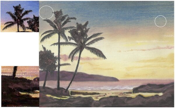 The sky problem is simple to overcome, notice the sand coloured Ingres pastel paper showing through the applied pastel in the blue sky, in particular in the areas within the white circles. This is because the 230 cool grey was not applied strong enough as a base for the blue pastel to be worked into. Study the small picture on the top left corner this is from my original reference picture supplied with the member's video of this subject, notice the difference in the tone.The trees needed to have a much stronger application of the darker colours - 181, 192 and 199, again this can be seen in the same small picture top left. The rocks have suffered the same fate as the trees and the same rules apply as above, stronger application of 181, 192 and 199. See the section of the original reference picture bottom right to see how these rocks should look.When applying colours to both the trees and the rocks, minimum use of base colours should be used as over application of these will weaken the effect the stronger colours have on the finished picture.The pencil numbers above are referring to the faber-castell pitt pastel pencil range and can be purchase via my online shop. To learn how to draw this palm tree sunset using pastel pencils, sign up for my pastel pencil tutorials.