

Otter Painting in Pastel Pencils - Feedback
Michelle sent me this lovely picture of an Otter that she has just completed using pastel pencils and has asked me to give her a few tips to help her improve the work.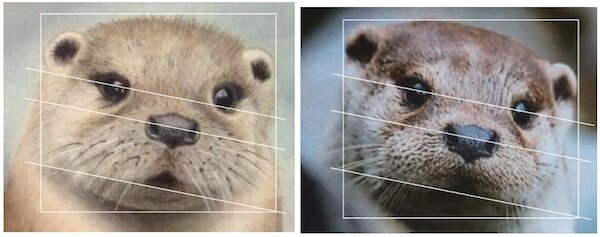 I have placed a white box around the head of both pictures above and you will notice that the proportions differ on the painting in particular the head and left ear. The alignment of the eyes are also slightly out as indicated by the lines. It is helpful when creating the line drawing to place a box and guide lines like this before drawing in the details thus avoiding problems like this once the picture is finished.The colours of the fur could be richer over the top of the head and then continued to other areas, for this I would consider using 169, 283 and just a hint of 177 added to the colours that are already there. I would also add 181 and 199 to the nose again this would enrich the painting. These numbers are from the faber castell pitt pastel pencil range.