

Kitten Picture Feedback
Martin has sent me his painting of ‘Kitten and Brick’ and has asked for a few tips on how this could be improved.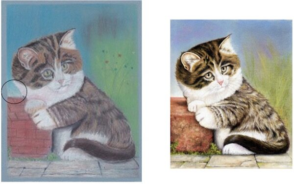 The first point I would like to raise is that Martin has used a mid blue colour paper for the picture, see the border, unfortunately this is showing through the whole painting and dulls down the lighter colours. Compare the brightness of my original on the right where I used our usual sand coloured pastel paper.Martin has used too much base colour when tackling the darker tones this has resulted in the stronger colours looking weak. It might still be possible to add 199 (black in the faber-castell pitt pastel pencil range) on top of these to add more strength.The area marked with a black circle shows the white fur against the blue background. As there should be shadow in this area it would be better to lighten the blue in this area and darken the white fur using the grey pastel pencils.The brick should not have the separations on it as it is a single brick, it would be easy to erase these and reapply the brick colours following the reference picture.On the whole this is a very good attempt at a tricky picture and Martin would have learned a lot from it. If you would like to learn how to draw this subject using pastel pencils then sign up to Colin Bradley Art.