

Karen's Horse Picture Tips
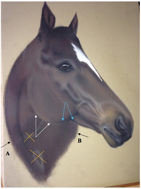 Karen has sent me this picture of a friend’s horse that she was commissioned to do and has asked if I can give her a few tips to improve the picture.First of all let me say that although you may be less than satisfied with your efforts I think you have done really well.You need to create more shadow on the neck under the head to pull the head away from the body where indicated by the white arrows. The blue arrows show the area of the head that can be left as it is you could even lighten the neck here slightly to give more impact.I strongly suggest that you put in a background colour as this would not only serve to enhance the subject but allow you to fade in the ‘scruffy’ areas at the bottom of the neck into this background colour, the two black arrows, all the way round the bottom from A to B blending this in to the background as you go. I would lay a base of 103 ivory rubbed well into the paper then add your choice of the lighter colours (no dark colours - keep this light) you have used in the horse.Lose the two faded areas marked with a yellow cross simply rub these into the horse colours surrounding them, add more colour if you need to.You will be amazed at the difference these changes would make and I would love to see the results once you have completed horse once you have finished.If you would like feedback on your artwork, become a member of Colin Bradley Art - it's one of member's benefits for joining! All the colours mentioned above are from Faber-Castell's Pitt Pastel Pencil Range, to view the range available, click here.To learn how to draw horses using pastel pencils, check out our horse workshop packs.