

Help with Charles' Cardinals Background
Charles sent us his Cardinals picture that he is working on and asked for some advice on the background. Charles has a membership which enables him to request advice on his work as well as access all our lessons. Charles writes:
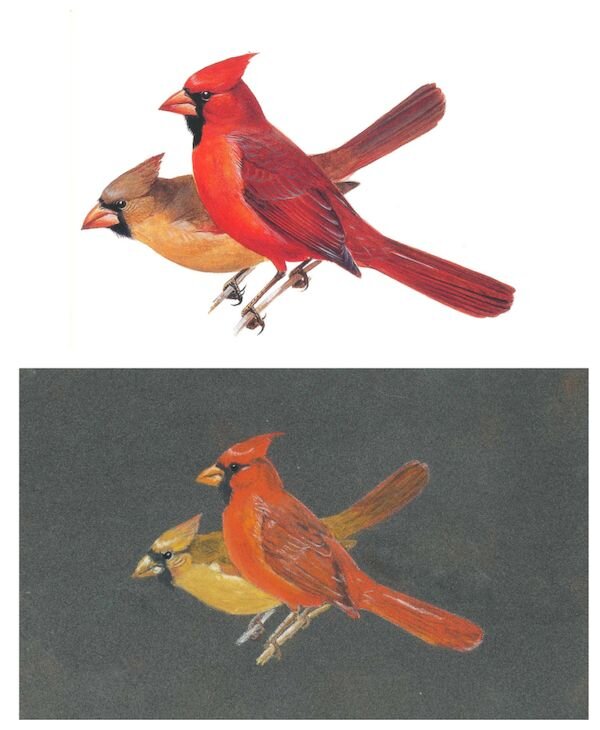
Hi, Steve and Colin,I was motivated to use the anthracite Pastelmat after watching the demonstration of the lighthouse and harbor at night. I thought a pair of American cardinals would do well on the anthracite, so I did a painting. It took me ages and I'm not sure whether any of it is any good.One big problem I've having: What do I do for the background? Shades of green suggesting shrubbery? White and green, suggesting snow and shrubs? Any suggestions along this line - and any comments about the paste painting itself - will be greatly appreciated.I have attached the reference photo as well. Thanking you kindly.Charles
 Listen to Colin's tips and advice in the recording below:
Transcription
Hi Charles. Stephen sent me your picture of the Cardinals and I think you've done a great job. There's a couple of little points I'd like to mention to you. One is at the underside of the birds, you haven't really paid attention to shadow, not irreversibly you can still put the shadows on follow the pictures that you're working from and you'll see that there's a darker area underneath where you get shadow. You always get that shadow because the light's playing above. So that's something I would do.And the other thing is you'd mentioned background. Well certainly I think this is a good idea. In fact it's imperative there. So what I would do is use a light grey. You'd have to use a light grey now pastelmat doesn't respond terribly well to the light colours so you may have to put it on and then reapply it again until you cover the paper up. Once that's the light grey is on then you can use Greens or whatever you fancy really. What I would do in this situation is check out the Internet and see pictures of cardinals and suggested backgrounds that they would because if they take a picture of a cardinal and most certainly the background will be foggy - it would be out of focus. And that's the kind of thing you're looking for. It might give you some ideas there. And if you do do this the other thing you're going to have to do is extend the branches. I don't think you'll find that too difficult. I wouldn't go behind the birds. But in front of the birds where the branch is at the bottom you'd have to extend those otherwise you'll have them floating in the air. And that just won't work at all. So what I would do is extend those branches perhaps to the bottom of the paper and then put your background on and then you might wish to cut in a bit on this. In other words if you want to mount it or frame it I would bring in a little bit so you haven't got quite so much paper showing around the bird.That should work really well for you. If it was me and I was doing another picture of a similar nature I would choose a lighter paper. Anthracite is great and for you mentioned the picture that I did. Obviously that is a great picture but it used the anthracite. Tn a situation like this the anthracite can or the dark colours can tend to dull down the colours of the pastel pencil. This is actually what's happened here. I wouldn't alter it, I wouldn't change it and I'd still use the picture because it's a good one. Hopefully that helps you. Bye for now.If you'd like to receive feedback on your artwork and find out the benefits of joining our membership, click here.