

Drawing Realistic Branches and Tree Trunks
One of our members Laura sent in a picture she is doing of the barn owl asking for advice on the tree trunk. Laura writes:
Hi I have a question for Colin regarding the barn owl I just finished which I have attached. I'm very new to the medium and I have been watching the videos.I seem to keep getting into the same recurring issue whenever I come across a branch or a log texture. I ran into this problem when I was doing the Kingfisher & now I've done the barn owl and I struggled again. My issue is when I watch Colin's creation of tree stumps/branches, he applies multiple layers of colour and in the end he ends up with beautiful texture. When I look at my photo after applying all the colours it feels like my colour combination has ultimately turned into a muddy looking blend and I've lost the realistic texture of the wood. Can you give me some advice on what I'm doing wrong? Thanks so much.Laura
 Listen to the advice below or read the transcription below that:Hi Laura, I'm not really surprised. This is universally a very very difficult type of subject. I've never really seen anybody any of my classes yet who have actually cracked it. So you see how hard it actually is and it's hard for me to to explain what I do. This is why I show it when you see me do something you've got to just pick up on those things. Let's give you a couple of things that I can see immediately with yours.
Taking Colour Off
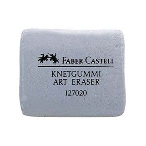 You haven't got the contrast, now it's all about contrast if we take the dark areas for the moment you've got to have lighter areas and you got to have darker areas. Now what would work with this if you've got a putty rubber (kneadable eraser). You could press that putty rubber on to the middle area of the dark. In other words under the claw of the Owl. If you press that putty rubber it will take quite a lot off. And you'll be amazed at how much detail you actually see in it. Very often I actually do this and I show it sometimes I show me actually using a putty rubber. In other words I apply a little too much colour and then I use the putty rubber to take it off.Now what you can do once you've taken it off now obviously if you put it back exactly the same and get it's not going to be worth it but you can just pick out bits of it that you want contrasting. In other words you want a few darker areas. Maybe you want to put a little light in because if you put the putty rubber on it the putty rubber will take some of the pastel off therefore you can put light back on.
Increasing Contrast
That's one of the things now the other thing is where you've got the dark contrast with that split down the top of the green right down to the bottom. If you make that dark and you put a bit of black in it.Now I know people think "oh I shouldn't be putting black on" but that will work. Now if you haven't got black then you can use 175 is another colour that will work. But black would be better if you can use it - that will give you a contrast.
Subduing Lines
Another problem that we have and you've got there is you've outlined the tree stump. Now I don't like lines and you've heard me say many times I don't like lines. What you do there is you just bring that line in rather than leave it as a line round the edge. In the case of the green you just use a very dark green there and bring that into the main area. In other words try to lose that line because it does look a little bit amateurish if you do that and you'll find up when I work on it you don't actually see that line you see any indication of a dark area but you don't see the line so that's another little tip that I can give you.One of the problems with green is if you put to too many colours on you dirty the green in other words so try to keep the greens free of too much brown and dark colours.
Summary
Now this is as I said it's really hard and I would recommend that you go onto the website and look at as many instances of trees/tree trunks, branches, I do lot of birds with them sitting on the tree trunks and see how I do it. Another thing you will see is in your picture you haven't really got a light and dark aspect. In other words a "shadowing" and this is something else that you've got to think about as well. Put a little bit of shadow in. Anyway. I hope this has helped. It's really difficult for me to explain how I do it but I can only suggest that you look as many as my examples that I've got on the website as possible. And I think you'll be amazed at what you can achieve. Okay Laura. I hope it works.