

Drawing a Golden Labrador on PastelMat with Pastel Pencils
When someone joins as a member on our website, they are able to receive feedback and advice on their artwork. In this case new member Gillina sent us an email of a Golden Labrador she's doing on Dark Grey PastelMat. Gillina writes:
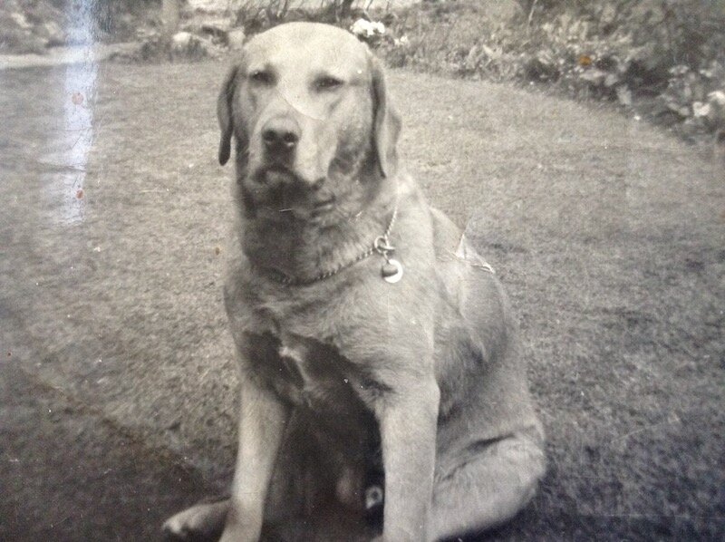
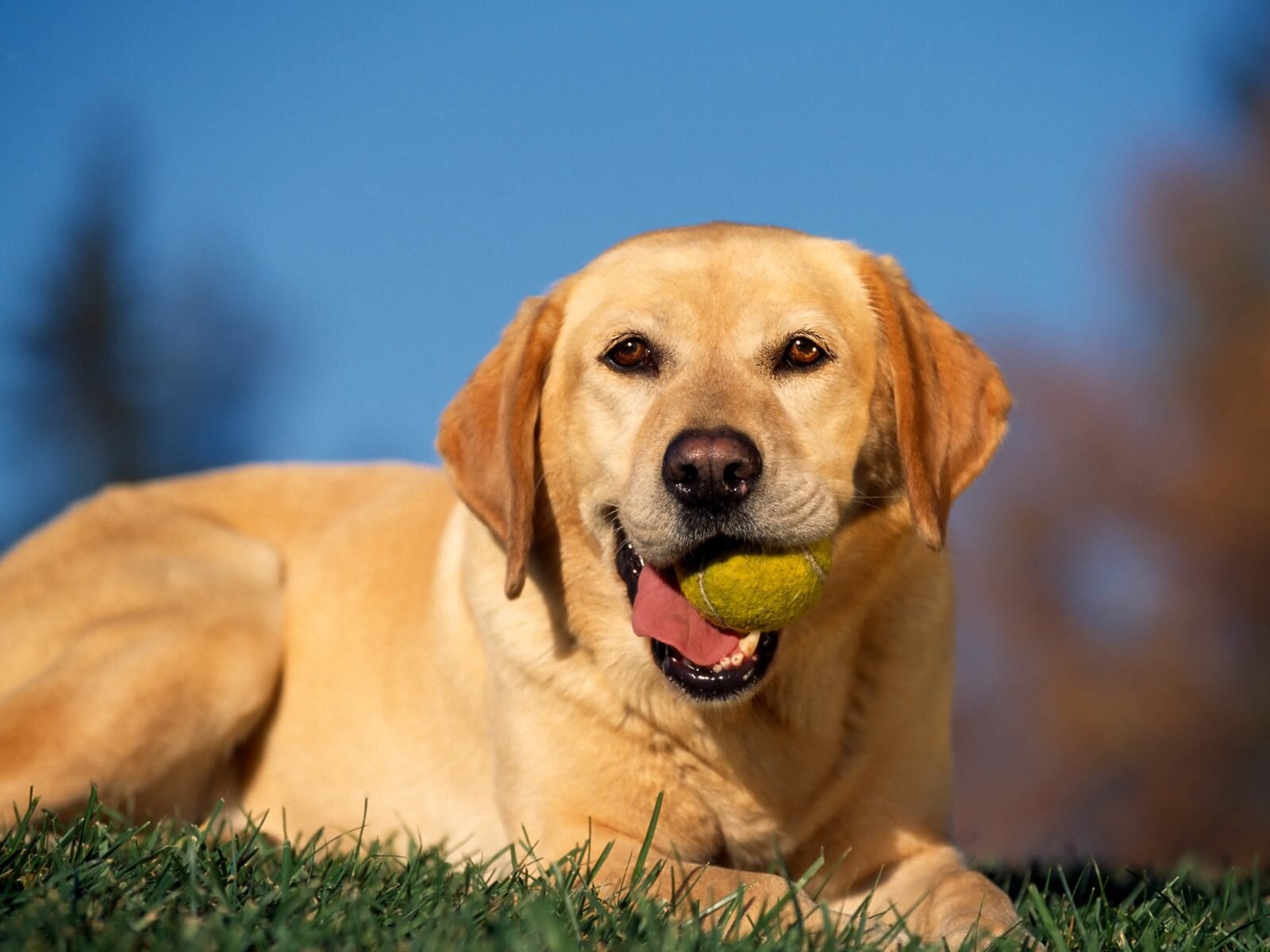
Hi Steve and CollinI am glad to now be a member. I need help on my project I'm trying to do. I only have a black and white photo of a dog that died many years ago when colour photos were not about then. I would like to surprise my mother and give her a colour photo of him (Sandy).So far I've been using other dog photos for colour reference. I'm using Pitt pastel Faber Castell pencils on a dark Gray pastel Matt, the large size out of the two. I would like to attach a photo of my picture so far (work in progress) along with the photo references. I've already decided I will put in proper eyes as it looks not quit right but I've not done that yet unless you say it looks ok. I just cannot get the colour right for the fur.Which pencils do you think might work the best. Pencil numbers ok with me. What do you think of it so far please before I carry on with it and make a mess? ????Kind RegardsGillina
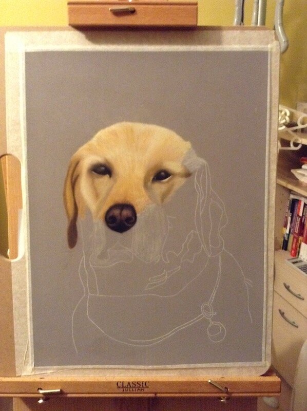
 Thanks Gillina for writing in and let me say first off I think she's doing a really good job.
Richness
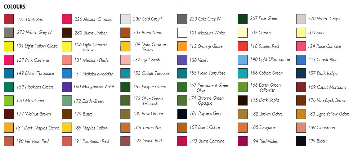 One thing she needs to do is to get out 186 (Terracotta), 187 (Burnt Ochre) and 283 (Burnt Sienna) - those are colours that will give you richness.The ear so far is looking a tad dull so adding them onto what she's already done (you can do this because it's pastelmat), you will get the richness of the colour of the ear. For a picture like this you cannot rely on memory alone, you've got to follow the reference picture that gives you the colours.She's already got the right undertones so she's nearly there. I would just add those colours to the ear and top of the head and into the colours she's already got.
The Eyes
For the eyes the 187 and 283 can be added to the eye. Because you can't see the eyes on the black and white photo you have to follow the light tones that you see in the colour photograph. You've got the right eye shape from the other picture so now it's following the colours on the colour photo.You could use 186 and 187, one might be better than the other or there's nothing wrong with putting both on, 186 is lighter than 187.
The Nose
For the light areas on the nose, you could put a little more brightness in there, a bit more white on the highlights (just like you would put highlights in the eye).Also just as a final point, if you look at both sides of the nose, she's got a line demarcation line. The one on the left is okay but the one on the right needs to be softened. If you study the black and white photo, you'll see at the moment it's a bit too heavy. The other side it's softened so now it needs to be done on the right too.I hope that helps, it's worth mentioning that if this was with Ingres Paper it would have been different. You wouldn't have been able to add in those extra colours quite as easily.If you would like to receive feedback on your artwork and access all our animal lessons then click here.