

Choosing Colours for Autumn Leaves
It's always tricky choosing colours for a project and one particular time of year we've been asked a lot about is Autumn. Here's our tips and recommendations for Autumn Landscapes using Pastel Pencils.Keep some greenStill use green - As well as the ochre, reddy-brown and orange colours, still use green in your leaves. Base ColoursThe problem with the colours above is that they can be very bright and garish. The way to subdue these colours and make them less bright is to use ivory and light greys as base colours.For the darker colours, you can use mid tone greys to subdue the colour. This is only our opinion, of course you can use the bright colours directly on the paper but if you think about it, Autumn leaves aren't bright and garish. They have a lightness to them which is slightly subdued. That's because the green leaves have naturally turned from bright green to the reddy-brown colour.Your leaves will look more natural with these base colours which is why we put them on.Take care with Red
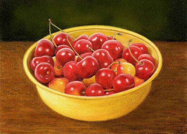 With Colin's recent reveal of the bowl of cherries in pastel pencils, the reds used in that picture won't go on top of other colours, they don't respond. What does help the red out is the sand coloured ingres pastel paper. If you put red on white paper it would be too bright, but the sand colour mutes the colour slightly.Bright colours can be used on their own but care must be taken to make sure they don't look too bright.Colin did an Autumn Mist Landscape which runs as an art course on this site. If you want to view the course and learn more about Autumn landscapes, sign up to be a member here.