Choosing Colours for a Liver Coloured Spaniel
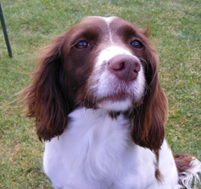
One of our members Glenda sent us a picture of her liver coloured spaniel and asked for some advice. She says:
Hi Steve, my membership is about to run out and before it does I was wondering if Colin could let me know what colours to use. I want to do my own dog which is a liver coloured springer.. I cannot seem to get it right.Regards Glenda
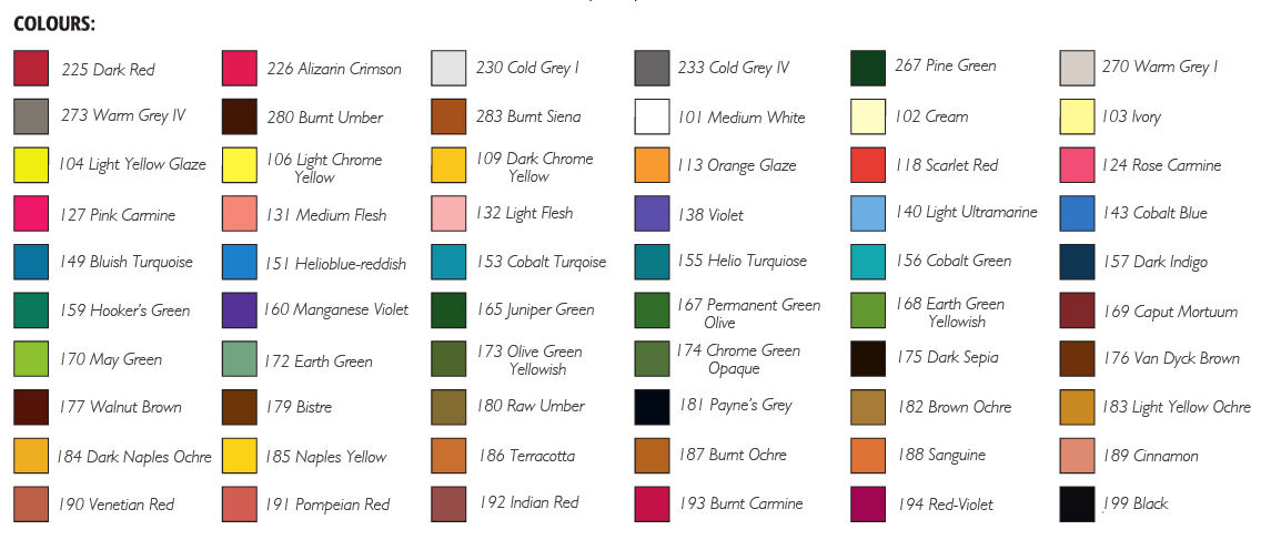
 As always the colours I am recommending are just a basic set of colours which you could use for the general tone. It's always recommended to test out these colours on spare paper first to ensure you're happy with how it looks. The colours referenced below are also from the Faber-Castell Pitt Pastel Pencil range which is what I use and recommend.[fusion_builder_container hundred_percent="yes" overflow="visible"][fusion_builder_row][fusion_builder_column type="1_1" background_position="left top" background_color="" border_size="" border_color="" border_style="solid" spacing="yes" background_image="" background_repeat="no-repeat" padding="" margin_top="0px" margin_bottom="0px" class="" id="" animation_type="" animation_speed="0.3" animation_direction="left" hide_on_mobile="no" center_content="no" min_height="none"]
General Tone
For the lighter areas this would be 230 which is a light grey and 233 (mid grey) in the darker areas. You're effectively going to be splitting this liver tone into light and darker areas with those colours I've suggested. You could also put a little 233 into the 230 as well in the light areas. This gives you the neutral base which we need because the colours we're going to put on next are fierce. This is of course assuming that Glenda is using the Sand Coloured Ingres Fabriano Paper which is a neutral tone.The next colour I would put on very carefully is 169 Caput Mortuum, this is the primary liver colour that you would need and we put it on now because it needs to be the dominant colour.Then you would have to mute it with other tones to stop it looking too strong. 280 and 181 are ideal for this. These look very strange colours to put on when you look at them independently but try putting them on top of these other colours and see if it gets the representation you need.I always say that there are going to be more colours that you will need but you can only tell this when you are looking at the colour on the paper.
Other Areas
For the white areas and nose, use a combination of these colours. White areas would naturally require white as the base, then 230 light grey and 233 mid grey. You could also add a hint of 169 caput mortuum, but not too much. Otherwise it would turn too "mauvey"!For the nose I wouldn't use white as the base. This would be 230, 233 and 169. As long as there is a good application of the light grey 230 because you'd need it to be light.For the eyes, stick with the grey - 233. Then try 283 Burnt Sienna and 187 Burnt Ochre to enrich the tone and then go in possibly with 181 Payne's Grey and Black to create depth.For the link between the white on the top of the nose and the liver colour of the animal you could use a little bit of white to start off with because it's very light. Then go in with 230 light grey.I hope that helps Glenda and others that are doing a similar subject. Again, these are the basic colours you could use to get the general tone of the animal.Advice such as the above is a bonus service to members of our website. If you would like help with your pictures and access all of our tutorials, learn about our membership here.[/fusion_builder_column][/fusion_builder_row][/fusion_builder_container]

