

Choosing Colours for a Child's Portrait
This picture was sent to us by one of our members Robert who asked if we could help with choosing the colours needed. Here's Rob's picture: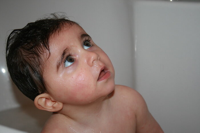 This is a tough portrait because well, all portraits are tough.I'm presuming that Rob's using the Sand Coloured Ingres Paper. All that colours that I suggest below are based on using this paper as it is a neutral tone. If you are using a dark paper then it would require different tones because you would have to get rid of the paper's dark colour first.As with all these kinds of requests, I can only give a rough idea of colours and there will inevitably be more required. The colours that I reference are from the Faber-Castell Pitt Pastel Pencil range which is what I use and recommend.
Skin Tones
I would start off with a white base and rub that well into the sand colour, this neutralised everything otherwise you would have a sand colour influence. I would then use ivory on top and 132 which is a light flesh. This would give a creamier look.I would then use 189 because it is a stronger pink. If you look at my previous portrait work you'll notice that I don't put flat colour over every time, e.g. not all over the skin. You will have to work out the contours. You can also use 230 which is a light grey in the areas that you want to have translucency.The next pink I would use would be 131 which would go into certain spots, for example the cheek. After all these colours are on, I would use 187 which is a burnt ochre. If it goes on too soon it will appear too rich. By having all these base colours down first, the richness will be tempered down.169 which is Caput Mortuum is a another colour that can be used in portraits. For stronger tones you could use 283 and a stronger pink such as 190 which is more like a red. These will bring out the features.That's where I would stop and look at the overall tones of the portrait and see if you could enhance it any further.
Eyes
For the eyes I would start off with white for the white of the eye and add 230 light grey to add a greyish colour to it, then 233 mid grey. It's worth noticing in this picture that the light is in the white of the eye not the pupil where we usually see it.As it is a brown eye I would suggest using 230 light grey, then 233 mid grey to create a foundation for the brown. Then something like 180 or 179 would work to start off the brown and then darken this base with 283 or 177.I would then recommend using either 175 Dark Sepia or 199 Black to create the dark colour. These final colours would depen on how it looks, at some point you have to make those initial colours darker.
Lips
For the lips I would consider using 189 which is cinnamon and 190 red possibly.These are basic colours that I can see being used in this picture. However I would be careful each successive colour especially the darker tones and decide at that time whether it's right or not. You can't predict a head of a picture unless you've done it before.
Hair
I would start off with white in the areas that shine. Then use a light grey 230 and add 283 on top. This builds up the base colour and then you can darken to get to your final tone soon as possible. For this I would suggest 175 dark sepia or black but also keep 177 handy which is a walnut brown just in case it's becoming too dark.Again no portrait can be cut and dry, it has to be thought of as you go along. Skin tones for children can have all sorts of colours in. There are a lot more likely to be required in this picture but this is something only known when you're doing a picture.Advice such as the above is a bonus service to members of our website. If you would like help with your pictures and access all of our tutorials, learn about our membership here.