Adding a Dark Background with Pastel Pencils
One of our members Rachel sent us in her picture that she's finished and now wishes to add a background however the reference picture is very dark. Rachel writes:
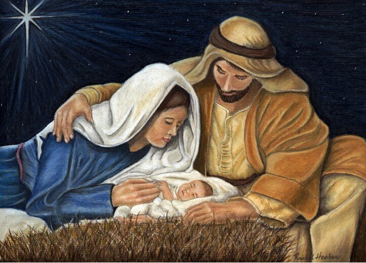
I have just finished this picture and now need to do a background.I'm worried about spoiling it. I do not want it too dark as when I try to go dark it turns smudge.
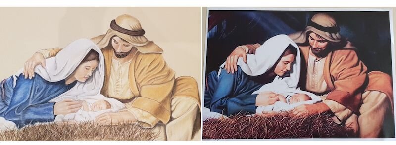 To listen or read Colin's advice, see below:Hi Rachel thanks for sending this lovely picture that you've done and you want some feedback on perhaps a background. What I've done is to crop your picture which I think looks really nice as it is and it just restricts the background little bit and I'm going to give you the colours in a minute.
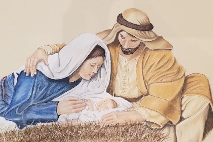 Couple of little small points though you'll see that when I've cropped it, at the bottom right hand corner has got a little bit of brown you'll need to fill that in that's fairly easy to do and just finished the lady's (or it would be Mary wouldn't it) Mary's dress on the left hand edge. We just need a little bit of work there but if you make that more or less the same size as I've given it would look really nice.
Base Colours
Now as far as the backgrounds concerned you've got to put one in because it's not going to work like that. But I agree you've got to be careful about the darkness. Now what I would do there if you got all our colours then I would use a 230 which is a cool grey and cover the whole of that background with it using your finger where you can and perhaps a colour shaper where you get close to the edge. You've got to go right up close and cut into all of the subject. So you've got a complete area covered with your 230.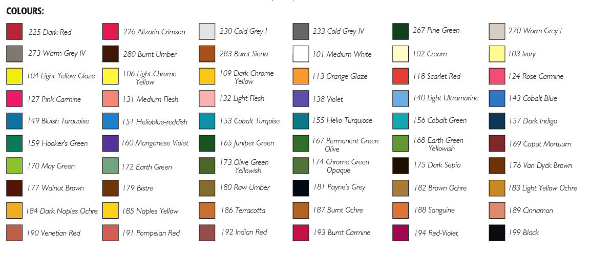 What this does is it gives you a really good base colour to put colours into. I would use a grey first of all which is 233 and put a little bit of that in and rub that into the background and then I would put in a blue. Now the blue that you used in Mary's dress would be a nice one. Put that in again rub that in the same way and as a lot of palaver I know and you think gosh I got to go this far but this is what I would do.
Additional Colours
Then another colour if you've got the colours is a 157 and that is a strong dark blue and I'd put that in. Now that would create like an evening sky and for that you can then leave it as it is or you can put a little bit of variation of tone in it. You could if you're brave put a few stars in you know just a few little stars which would be rather nice. I'll leave that to you to decide whether you should do that. But I think that would really really set it off. What it would do would set off the whole picture and make it look really nice when you do that though you may well have to darken the bottom where the straw is or the hay or whatever it is you may have to darken that a little bit more. Otherwise it might be a little bit top heavy. Give it a go.You can do this by degrees in other words if you put the two colours on and you know the greys and you think that looks okay and perhaps a little blue and don't go as far as I am suggesting then that's fine. But this is a lovely picture and I think it would make a really really nice Christmas card. I'm sure you'd be more pleased with it and I'm delighted with it. And if you do this Steve and I would love you to send this back to us and perhaps we can feature it.If you would like to learn how to use pastel pencils and receive feedback on your work, please have a look at our membership where you can access hundreds of lessons across a range of subjects.
Update:
Rachel sent us her finished picture and I think you'll agree it has turned out brilliantly.