

A Bar at the Folies-Bergère in Pastel Pencils

We're so excited to reveal that the 3rd Demonstration picture is “A Bar at the Folies-Bergère” by Édouard Manet! These demonstrations show advanced techniques and are designed to show how far you can push the pastel pencil medium.This picture really pushes the boundaries and is a masterclass in impressionism. As stated, these are demonstrations, so if you would like to follow along then you can give it a go. However, it will be difficult!There is still so much you can learn just by watching Colin work the pencils in such a way to produce amazing effects.The demonstration is 6 hours long split into 6 episodes and is available to ALL IN Members only. To see our membership plans click here.To view the demonstration, members login and go to the “Demonstrations” section under the Pastel Pencil heading. Alternatively, click here to go straight to it ????If you would like to hear more about the picture, why Colin chose this subject and the materials behind it, listen to our podcast below. We’ve also included a transcription if you would like to read along.Download this PodcastStephen Bradley: Hello and welcome to Colin Bradley Art Cast. I am Stephen Bradley and I am Colin Bradley. This is going to be a special one. Cause we haven’t done this in a while. A few months actually. That we’ve revealed another demonstration it’s been a long time coming and you’ve done quite a few since we last released one. This was quite a hard choice deciding what to do next. But you come to a decision and it is for a very valid reason. So the picture that everyone’s seen now is… what’s the actual name?Colin Bradley: It’s a Bar at the Folies-Bergere , in Paris by Edouard Manet. It’s not Edward it’s Edouard.Stephen Bradley: Is that because he’s French.Colin Bradley: Absolutely.Stephen Bradley: And this is an incredible picture. It sort of speaks for itself when people see it. We don’t need to say that. So let’s start with the obvious. Why did you choose this picture?Colin Bradley: Well Manet along with Renoir has been my favourite artist. Now the reason is that both Renoir and Manet although their impressionists they kind of have a sense of realism within their work.Stephen Bradley: Is it because it’s closest to your work would you say?Colin Bradley: It’s easier for me really. Having said that when people see the others they’ll say what you’re talking about Colin! Coming from Constable as I did originally – that was my favourite artist early on. But you move out of the sort of realistic type of work into the more impressionistic type of work. And that’s how it’s been with me but you can go overboard and some of the artists the Impressionist art is a little bit too way out for me you know like Monet although I do like the odd MonetStephen Bradley: We may have a Monet as well..Colin Bradley: That’s one of the better ones and Van Gough and Suzanne these artists – great artists but they were just a little bit too over the top as far as I was concerned from the impressionist point of view. But Manet and Renoir who I am featuring too were nearer to the kind of thing that I loved. Anyway I chose this particular picture because I think it’s probably the most famous of all Manet’s work. It was also unfortunately the last one he produced. He was very very ill when he actually painted that picture. I think the word is almost on his deathbed – wasn’t quite there but he was getting there. But it turned out to be in my opinion the best picture. There’s a lot of things that and we are going to supply little clips of Youtube clips which I’ve found that people can have a look at where better explained than I just you know I’m just starting out on this but these people have studied all of his work.So this is the reason why I chose it. It’s a brilliant picture. I love doing it and I loved every minute of it and people will see that when they see the actual demonstration that I give. Like everything else when I start a picture like this. I’m not really sure am I going to succeed because it is quite an undertaking to take something as famous as that is like it was with Constable’s Cornfield and then produce it – so I wasn’t quite sure. But by the time I was about a third of the way through it I knew that yes I was going to finish it because I was enjoying it so much and there’s so much to it. So this is the reason I chose Manet and I do like his other work. He’s got lots and lots of pictures. I was recently at the London gallery, the National Gallery in London where they got an impressionist exhibition at the moment and that was one of them. And when I saw it I was just absolutely bowled over but that doesn’t describe it. I was just looking at it and I couldn’t believe that I was actually that close to the real thing and I’ve got a picture and a let you have that picture you can put it on one of the clips of me standing alongside it. It was absolutely breathtaking. So that’s the reason I chose it.
 Stephen Bradley: Fantastic. We like to talk about when we do one of these pictures because it’s so tricky to get and we’ll get into the nitty gritty of it in a moment because I think it’s a good behind the scenes for people to understand the process that you went through with this. But before I do that we’ve been with the demonstrations introducing new materials and new pencils and things so let’s just skirt over what used within this picture. It’s on pastelmat, the dark grey, which is like the other demonstrations which obviously I’m assuming just completely lend itself to a picture of this detail and calibre.Colin Bradley: In fact it’s amazing when you look at the picture especially looking at it from a few feet away you say how do you put all those little people in? It’s not until you get really close and I hope people will magnify it on their computer although they’ll see me working with it anyway and close up on those all those characters in the background – they’re just blobs. And that’s exactly what Manet did. Quite incredible how you can actually produce it and the pastel pencils worked brilliantly with it. So yes it’s on pastelmat, dark grey pastelmat and cretacolor, carbothello, faber, I used all three. Mostly Faber I’ve got to say a lot of cretacolor and the odd Carbothello.Stephen Bradley: Did you find that there was some tones like the cretacolor is more pinks and greys – did you find that you dip into those other brands for when you need a bit more of a wider range?Colin Bradley: I think the Faber-Castell I would say is your base, those are all your base colours – your earth colours and those are the colours that you would rely on. But when you want something a little brighter – you go down the Cretacolor road or if you want to go brighter still, you go down there Carbothello road but a picture is consists of all of those elements put together. So this is why I say really you do need the extra. I mean there’s no pencils. Because this is a demonstrations I don’t give you pencil numbers for this – it would be impossible there’s so many and I cant keep track of them all. So I give you a line drawing anybody wants have a go at it you know they obviously can we give a line drawing with it. So you do need all of those pencils. I don’t think I could have done that picture with just Faber-Castell. I could have done it but it wouldn’t have looked the same..Stephen Bradley: It would have been more difficult because I guess you’ve got those in between. You would have to make up more tones and therefore you’re limited to the actual paper itself as well. But if you’ve got those tones in between then you mean you’re putting less pastel on.Colin Bradley: That’s right. One misconception is people think that you can leave the colour of the paper showing through you can’t, not with this you’ve got to colour the paper but I’ve got to say that if you’ve got a dark grey paper and you are using very dark some of the dark colours it’s an influence behind it but you still have to put the base colours. Just as an artist in Oil wouldn’t just leave the canvas showing through. Well I think some of them do but generally they wouldn’t do that they would cover it with base colours or ground colours first.Stephen Bradley: But then I know that this isn’t the case but one might ask if the paper is being completely covered then does the paper matter?Colin Bradley: Yes it does matter it does matter because when you’re applying the colours you can see the colours the vibrancy of the colours better against the dark background if thats what you’re trying to do. There are a few demonstrations that are coming up in the next year or two that are done on sand colour or the lighter colours and so I just choose the paper according to how I feel about the picture.Stephen Bradley: Yeah. Lovely. Okay let’s talk about the nitty gritty behind some of this because the picture isn’t realistic in the sense of the reflections. So let’s talk about that what was your feelings towards that – does that add to the charm of it?
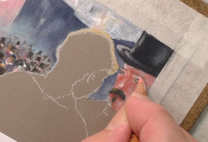 Colin Bradley: Oh yes it does. And there’s a lot been said about this picture and there’s a lot of lot of criticism that the reflection isn’t true and that is absolutely right. Because when you look at the young lady who incidentally is Suzon that’s her name. She was a bar lady. She was a waitress and a bar attendant. So she’s a real person and she was originally to the right of just about where that pillar is. So she was there. He originally sketched her to be there. So the reflection would have been a little better but he obviously didn’t like that so he put her in the middle but still kept their reflection on the right. But by doing that what he’s done is open the picture up because you imagine if those gentlemen and the reflection of her was more in the centre it would have covered all of those people up. So artistic license comes into play here and move them over like… When I was in the National Gallery I happened to go to the Cornfield and in the write up alongside the cornfield was that church that’s in the middle.. he made it up, he invented it. So you see artists can do this.Stephen Bradley: That’s what you do. And you demonstrate that don’t you..Colin Bradley: Absolutely. So he probably took a bit of a risk there because he probably knew he was going to be you know pulled over the coals for it… But then you know he probably didn’t care very much because you know he said I probably won’t be around when this becomes popular. So no but it was criticised for that. So the reflection is not accurate but does it matter? I don’t think it does. I think it looks absolutely beautiful I wouldn’t change one bit of that picture.Stephen Bradley: Did that make it any stranger doing the picture knowing that the reflection is off?Colin Bradley: No because I love the picture. When I first saw that picture I fell in love with the picture. So that guided me I thought well if I fell in love with it I must have accepted it for what it is it because if you think about it you’ve got to portrait there you’ve got a lovely landscaping of characters behind which I really love doing. And of course a load of still life in the foreground so you’ve got everything..Stephen Bradley: I’ve just realised though dad but there’s less to red here… There’s one red here – isn’t that a reflection? I mean if that’s you know you cant you cant really criticise it if the reflection is off but I just noticed that there but it’s really special because its one of those pictures you just stare and stare and stare at. And I bet even at the National Gallery the size of it you could just stare at it for hours..picking bits out.Colin Bradley: I’ve made my mind up to go back again. This was a couple of weeks ago when I went up there. So I’m going to go back again and this time Im going to spend a lot longer there.
 Stephen Bradley: Let’s talk about the obvious. How did you get all those people in?Colin Bradley: Have you counted them?Stephen Bradley: No, have you?! People can let us know, if they want to do that and they can do that.Colin Bradley: No I didn’t. And of course when you’re copying something like that its your interpretation of them so if they look at the original Manet picture they would see it probably slightly different to what I had done it. The people in the balcony through the mirror because we’re looking into a mirror. So we’re looking at what she’s looking at effectively, those people were pretty accurate but when you go beyond that, all the little top hats or people…Stephen Bradley: You have to do that though don’t you? You have to go off a bit because absolutely you cant. It’s like drawing every strain of hair isn’t it it’s like you have to at some point go well I’ve got to do my own thing a little bit here.Colin Bradley: Absolutely. And it wouldn’t look anything either you’d have to do that. You have to just put little blobs here and little blob there. As long as when you look back on it you pull back on it it looks right, that’s the important thing. Though I loved doing that I didn’t think I would have got to say and that little trapeze legs on the top left that’s something again it’s a masterstroke. Absolutely beautiful picture as I say it’s one of the most famous pictures certainly Manet’s most famous picture.
 Stephen Bradley: The other thing that I find interesting with this and it’s similar to the Reggianini is the materials the texture of the materials and the bar of the balcony and things like that. Now you had the experience of doing the Reggianini, so did that seem like you know because even things like the glass like I feel like this picture is a really good sort of lesson on how to do objects and materials. And I think that that’s something that we haven’t covered before in such detail.Colin Bradley: No we haven’t. No you’re absolutely right that’s a black velvet dress by the way. That’s a black velvet dress and then you’ve got all of the the White filigree going and the flowers. How do you do that?Stephen Bradley: I love the flower in the glass in the middle. Yes. I think that’s because that’s see through. So then you’ve got the you know all of those techniques of drawing it through that I mean it’s incredible it looks incredibly challenging.Colin Bradley: It is easier than you think it is when you see me do it. When you look at it you see oh I’m not going to tell you how I did that filigree. I thought how do I do that. I can put the white on first that’s impossible but is it impossible? No it isn’t impossible. You have to put the white on first you can put it over the top of the black so you put that in and then you put the black velvet the colours you put the black velvet into that to interweave it to make it look like that quite amazing and far as I know pastel pencil is probably the only material part from the oil, you can do it with. It’s wonderful you’re quite right though the glass there’s so much in that. Incidentally, the two bottles there with the red triangle on you know that’s Bass Pale Ale – still around today…Stephen Bradley: The bottles do look stunning as well, got to say the reflections and the light in those bottles..Colin Bradley: There is only one thing that people might pick up on if they recognise this picture on the left hand side there’s three bottles of champagne in the foreground. There were four and I left one off.Stephen Bradley: Why did you do that?Colin Bradley: Well I did that because I wanted to see more of the marble. I wanted to have a little gap between the two. So I did that. If Manet had did that he’d have through “Yeah it’s a good idea I shouldn’t have done that.”Stephen Bradley: The oranges just want to touch upon those – still life. It’s just you know there is still life on our website but I feel like just little things like those oranges looks so juicy and real.Colin Bradley: That’s right. It’s again it’s the application of the pastel and how clean you can be with something like that. If you try to mess it around if you try to muck around with that it doesn’t work. So you’ve got to know exactly what colour to put on to start and then the colours that you add to those have got to be crisp.Stephen Bradley: That’s a really valid point.Colin Bradley: Well people will see it. The wonderful thing about this is that all the things I’m talking about people would be able to see it for themselves.Stephen Bradley: So the last thing I want to talk about before we sign off is whether people should give it a go? And at what level do you think people should give it a go. Because all of our demonstrations we’ve said if you feel like you know want to give it a go and they have and a lot of people have done great jobs of the pictures so far this looks like it’s ridiculously hard.Colin Bradley: Well it is. When I said it’s easier than you think it’s easier than you think it is but it’s still very very hard to do. People will find the most problems will be in the background with all of the characters. That is hard because you have to have a lot of experience to be able to suggest what’s there but do have a go but the whole idea of the demonstration is to show how good the pastel pencils are and what they’re capable of doing and being a demonstration, I hope people see it look at it and enjoy the process.Stephen Bradley: What do you think people will get out most about this. What techniques will they take away?Colin Bradley: Well apart from anything else they’ll understand why I love impressionism and they can take away from it the fact that you don’t have to put every stroke in particularly in the flowers if they close up on those flowers. I’d like people to blow them up you know fill the screen. You’ll see that it’s just a little flick of colour, rather than from here well I’m looking at it from 18 inches away it looks very tight. It looks very exact but it isn’t. If you look close and this is again this is what impressionism is all about it’s just suggesting rather than putting in. If you try to draw round every tiny stamen and every tiny petal you’ll fail miserably. It just won’t work that way. And this is the way I’m going. And certainly with my later work that I’m doing a lot of work at the moment as you know and with all sorts of things animals and flowers. I’ve just done a vase of flowers and I use a lot of the technique I’ve picked up from that on that vase of flowers particularly the see through jar that I’ve done and you see at one time I probably wouldn’t have thought about how do I do that. But having done now quite a lot of the impressionist pictures I can see how the masters did it so I just learnt from that. So I learn from it.Stephen Bradley: I think that’s a really good takeaway actually. Yeah. I think this is a masterclass in Impressionism.Colin Bradley: Oh without doubt. And if you like this folks I’ve got to tell you there’s a lot to come.Stephen Bradley: I think that’s a great point to end this podcast and introduction to this picture. If you’re on the website and you’re just about to scroll down and start the first episode then I wish you good luck and enjoy it and we cant wait to show you more in another few months will have another picture, another demonstration that will challenge you, test you and show you even more how far you can take the past pencil. We’ll be back soon with another podcast catching up with questions and your feedback and your emails and offering some advice and in the meantime enjoy.
Membership
If you want to learn more about our membership and how you can get:
- Access to ALL our courses
- Feedback on your Artwork from Colin
- Access to our advanced Demonstrations
- 80 Written Instruction Packs (Worth £239)
- 10 E-Books (Worth £29)
- 33 Exercise Sheets (Worth £26)
Click here to learn more.For those that are already members we hope you enjoy the new Demonstration and we can't wait to show you the next one![fusion_tagline_box backgroundcolor="" shadow="no" shadowopacity="0.7" border="0" bordercolor="" highlightposition="left" content_alignment="left" link="https://colinbradleyart.com/draw-stunning-pastel-pictures-with-our-free-lessons/" button="FREE COURSES" linktarget="_self" modal="" button_size="" button_type="flat" button_shape="square" buttoncolor="default" title="Try Our Free Courses" description="Interested in trying Pastel Pencils? We have free courses for drawing Animals, Landscapes and Portraits." margin_top="" margin_bottom="" hide_on_mobile="small-visibility,medium-visibility,large-visibility" class="" id="" animation_type="" animation_direction="left" animation_speed="0.3" animation_offset=""][/fusion_tagline_box]